Brillante Interiors project
I was recently asked to be a guest writer on their blog and since I am very busy with a project I chose to send something already prepared:
"The colors of our life"
an article I have written recently for a new Vancouver magazine on real estate, which will be distributed to 5000 local home owners in 2011. This way all my readers from Amman to Melbourne and beyond (yes I have readers all over the world and I am still amazed and thankful for blogging) can read the article.So now please go to Betterfly, clicking HERE, and read what I mean by "The colors of our life".
As for the armchair above I have a long story to tell you.
Year 1971 - Milan - Two sofas and one chair were bought in Milan for my first apartment, made by the famous Poltrona Frau,
Poltrona Frau logo
Year 2005 - Vancouver - After more than thirty years the abused leather was tired and even if worn out leather has now become fashionable, I decided to re-upholster them, this time in a totally new way: a silky velvet by Robert Allen in two different but complimentary colors, a fresh tender green and a hot pink! What can I say, I am not afraid of colors. I still remember the surprise and joy on my upholsterer face when he discovered the way Poltrona Frau builds furniture, he had never seen such a superb craftsmanship. Six years later I still adore my renewed furniture and I am not tired of the look.
Brillante Interiors project in progress
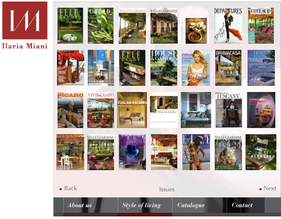
Ilaria Miani, from Rome, was the designer featured on the cover and you can see the similarities with my sofas (the actual colors in my place and the ones on the cover are much more similar then they appear here!)
Ilaria Miani project

Ilaria Miani website
Ilaria Miani and Albarosa Simonetti...were they separated at birth?
If you receive this post by Email and wish to leave a comment please click HERE and go to the comments section.
I love to hear from you!


11 comments:
yes, great minds do think alike... and I so love the colors of your room...very pretty... and that first pic with the painting above is gorgeous...
maureen
I so enjoy your posts Albarosa! You are truly a woman ahead of your time!
the colors on your couch are just tremendous. I love those colors together!
I love it when LIFE gives me affirmations. I can only imagine your joy at seeing your creation and color choices being highlighted. And those colors still "rock" today. Have a great week. Mary
I have been to Milan and loved it-but then I love you + all things Italian!!!! You have certainly given the answer to the question-"Should a person invest in well made furniture?" A loud "YES" was shouted- as you will have it MANY years. Great Post! xxpeggybraswelldesign.com
I love your sofas - they are so luscious to the touch and they look amazing.
I have to say that if they didnt have that your refined eye when selecting the fabrics they could look over killing. I like the fact that your pieces are bit tone done than the other version, so they become more versatile and timeless.
See, Albarosa, this is the reason why Vancouver and Milan Homes need more of your sophisticated eye. - You can be elegant and fun!
Oh Albarosa, a fascianating story and you are such a visionary! I love the colors you chose and agree with Ivan's comment.
xoxo
Karena
Art by Karena
Love your choices of color, osé (daring)and joyous, very Venizia..
decogirlmontreal
I found you from a comment you left on Habitually Chic! Love your blog and all of you blogging resolutions, too funny! I am your newest follower. Can't wait to see what else you have up your sleeve.
s
So luxurious and beautiful!! The colors you chose are one of my favorite combinations, this look is classy and timeless, as you have proved!
Nancy xo
I agree with Meade Design, yours are softer and more pleasant to live with. Would you make a post on your paintings? Did you have the sofa in mind when you chose the painting above? and the ones on the floor. I am always curious as to how interior designers select the art work and where and how they place them.
Post a Comment