This Milanese apartment is home to a big collection of major names in contemporary art and also to fine historical design pieces, both a passion of the owners.
The art is museum quality but certainly this home does not look like a museum, but has instead a warm, inviting feeling, due in part to the use of red and orange to create a high energy atmosphere.
Light is abundant and the architects, Studio Cerri & Associati, have allowed it into the space using fine linen for the white shades covering the large windows.
The light coloured wood floor creates a nice flow between rooms, the choice of pure white for the walls creates a perfect background for the contemporary art.
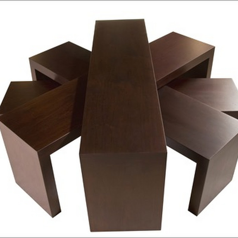
Bookcase designed by Alfredo Häberli for Quodes, Herman Miller red chair designed by Charles Eames.
Art and design also in the study, with Tizio lamp by Artemide and the iconic television Algon by Brionvega
A simple but elegant "boiserie" defines the entrance, the corridors and the bathrooms.
A bed by Rodolfo Dordoni for Flou and chaise-longue produced by Vitra on Eames design, lights designed by Arne Jacobsen. The arc shaped windows reveal that this Milanese apartment is part of a historical building.
The functional kitchen Nuvole designed by Luca Meda for Dada with a courageous choice of a strong, energizing colour for the lacquered cabinets.

Adjacent to the kitchen a small dining area with a marble table designed in the 70's by Ettore Sottsass and extra light chairs designed by Gio' Ponti and produced by Cassina.
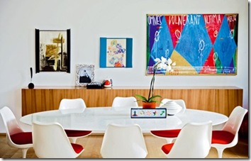
In the more formal dining area we recognize the Saarinen table and chairs, produced by Knoll, while the wood piece of furniture behind is designed by the same architects in charge of the renovation.
Luminosity and a great layout create a perfect background for a stunning collection of art.


10 comments:
I love the hits of colour through the whole apartment. The orange kitchen cabinets are fantastic!! And the crooked bookcase is fun and whimsical :-)
Thanks for your comment on my kitchen post, and your opinion on the sink. I'm still weighing the pros & cons of a one-bowl sink vs. two-bowl sink. But we bought our granite today, so at least that's one decision made :-)
Enjoy the rest of your weekend :-)
Kelly
Wow. The teak, the colour orange and that mirror over the vanity... great images and sources...
thanks!
I love those egg chairs! And I don't think I would tire of having one of my favourite colours on the cabinets!
Beautiful!
Cara,
May I pick a choice? Thanks... I would go for the Saarinen table and combine it w the Gio Ponti Spaghetti chairs for my sala di pranzo, and then switch on my Artemide Tizio and throw myself into the Jacobsen Agget. That would be really something! Bacione, Ingrid in Umbria
LOVE all the hints of RED... I was a little more brave with RED... it's on all my dining room walls... it is a VERY WARM room!
beautiful post!!
i have to tell you you were wrong
daughter is houst #2!!!!
Nothing like a pop of red or orange to invigorate a room!
Beautiful contemporary interior decor! Like the vibrant bright colors used in this Milanese apartment.
Hi,
Where can I find the artist who did the paintings above the red chair in your photo? The white painting + two red ones. I love the placement.
It is the first photo on your page.
Nina Nielsen
California
Design lovers you have to meet this Brand. www.bocadolobo.com
Post a Comment