Monday, January 31, 2011

Be better! At anything!

Brillante Interiors project

“Be better! At anything!”  This is the mantra for Betterfly: an online  service to find the right people to help you learn, look and feel better.
I was recently asked to be a guest writer on their blog and since I am very busy with a project I chose to send something already prepared:
"The colors of our life" 
an article I have written recently for a new Vancouver magazine on real estate, which will be distributed to 5000 local home owners in 2011. This way all my readers from Amman to Melbourne and beyond (yes I have readers all over the world and I am still amazed and thankful for blogging) can read the article.
So now please go to Betterfly, clicking HERE, and read what I mean by "The colors of our life".
As for the armchair above I have a long story to tell you.

Year 1971 - Milan - Two sofas and one chair were bought in Milan for my first apartment, made by the famous Poltrona Frau,
logo_top

back then they were covered in a gorgeous cognac color and in the most supple leather, with super comfortable loose cushions and a contemporary line that did indeed stand the test of time.

Year 2005 - Vancouver - After more than thirty years the abused leather was tired and even if worn out leather has now become fashionable, I decided to re-upholster them, this time in a totally new way: a silky velvet by Robert Allen in two different but complimentary colors, a fresh tender green and a hot pink! What can I say, I am not afraid of colors. I still remember the surprise and joy on my upholsterer face when he discovered the way  Poltrona Frau  builds furniture, he had never seen such a superb craftsmanship.  Six years later I still adore my renewed furniture and I am not tired of the look.

salotto
Brillante  Interiors project in progress

Year 2007 - Milan - About two years after the re-upholstery job I was in Italy and I went to buy the usual stack of Design magazines...to my amazement on the cover of March 2007 "Ville Giardini" a luxury monthly Italian publication there was my living room or actually something very similar, same style of sofas, two color velvet, fresh green and hot pink exactly like mine but this time they used the green for cushions and the pink for the frame.
Ilaria Miani, from Rome, was the designer featured on the cover and you can see the similarities with my sofas (the actual colors in my place and the ones on the cover are much more similar then they appear here!)
12-2-2010 8-19-37 PM
Ilaria Miani project

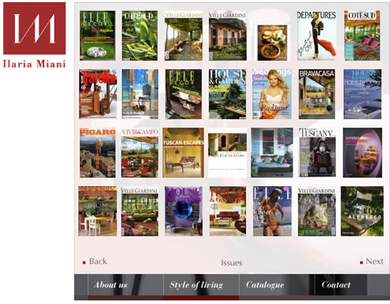
On her website there are three pages of Magazines where she was featured and you can find,  bottom row, the cover of Ville Giardini magazine I am talking about.
12-2-2010 8-34-24 PM
Ilaria Miani website

Many thanks to Betterfly for featuring one of my articles and for giving me the opportunity to talk in this post about the mysterious coincidence of similar living rooms in two continents.
Ilaria Miani and Albarosa Simonetti...were they separated at birth?


If you receive this post by Email and wish to leave a comment please click HERE and go to the comments section.
I love to hear from you!

Monday, January 24, 2011

The joy of winter


It is cold outside!
Do you like cocooning?

Sunday 8:00 AM
In the morning the bathroom will greet you with warmth created by this central multitasking element: a mirror, a divider but also… a heater…designed by Patricia Urquiola for Axor.

10:00 AM
1-24-2011 12-48-06 PM
Loro Piana
A walk in the park well dressed in Loro Piana jacket and accessories.

3:00 PM
07_b_caldo-casa
A fireplace, soft rugs, a cozy chair, several books to entertain you, let it snow!

06_b_caldo-casa
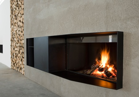
Nothing can replace a real flame, it will keep you busy arranging the logs and entertained with crackling sounds and dancing flames. 

03_b_caldo-casa
Loro Piana
Throw Lake Placid in cashmere with  suède finishing, by Loro Piana to feel the warmth
when sitting on the sofa.

5:00 PM


10_b_arredi-comfort
Alessi
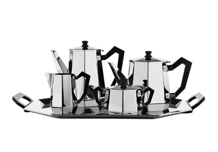
A cup of hot tea? Serve it with this tea set by Alessi, designed in 1935 and recently produced again, made of stainless steel and black Bakelite.

8:00 PM

1-24-2011 12-50-45 PM
Loro Piana
Going out for dinner in an a elegant reversible trench and accessories by Loro Piana
 
11:00 PM
 08_b_caldo-casa
Cinelli
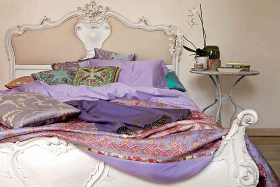
Going to bed under the Marea elegant bedspread by Cinelli, filled with Siberian goose feathers with a new quilting technique.

02_b_bello-inverno
Etro casa
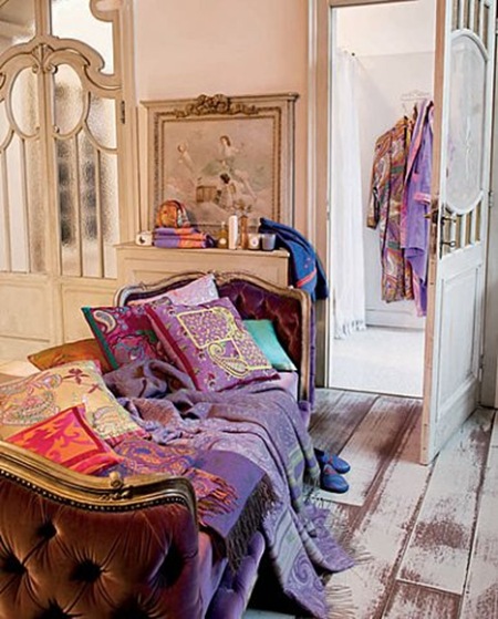
Or choose these velvet and wool blankets in tartan pattern or patchwork, by Etro,
to keep you warm and happy.
Enjoy the winter!


If you receive this post by Email and wish to leave a comment please click HERE and go to the comments section.
I love to hear from you!

Thursday, January 20, 2011

Brillante choice


Chair Mondrian by Daniel Rode for Cantori
A chair with personality, to be used around a dining table or alone in a living room. The sinuous forms are designed to create appeal and comfort. On the back a big zipper adds a graphic touch but its function is also practical, since the cover can be removed. The ring becomes a jewel, finished in silver leaf, black or chrome. The cover comes in different colors, and for an eclectic and young looking house it would be fun to mix them.
Is it a chair or an evening dress?

If you receive this post by Email and wish to leave a comment please click HERE and go to the comments section.
I love to hear from you!

Tuesday, January 18, 2011

Good-bye Brillante Home Decor


A new year, a new name...
Good-bye Brillante Home Decor
Welcome Brillante Interiors

Signature_Brillante
Year 2008 - Ben Ze Wang, a talented graphic designer and a good friend helped me to structure  my website three years ago. At the time, for still to me mysterious reasons, and only me to blame, I chose the name Brillante Home Decor, only after a few months it  did not appeal to me anymore but company was formed, business cards were printed and soon I had my own blog by the same name. I am not even mentioning the fact that most people spell Brillante wrongly because in English is Brilliant with one more " i " but I decided that Brillante needed to stay because was the major part of my identity... too bad, so what...keep calm and carry on!
Picture 003
Year 2011 – The great team at Meade Design Group helped to rebrand Brillante and changes were made to my web site and logo, new business card and stationery were printed and so on. All of you with a web site or a blog know how many little details are part of each project dealt with countless phone calls, emails, moments of panic (on my side) thinking “I have lost every data” moment of despair (again on my side) “This will never work” but at the end like magic and very much like in Interior design business everything comes together beautifully.
It is priceless to have the right tools to promote your business properly and in a professional manner.
My deepest thanks go to Ben Ze Wang for creating  my beautiful website three years ago and taking some of my portrait pictures, to Gareth Sirotnik for patiently editing my original web site text and last, but only in terms of time, to
Meade Design Group for giving me a new identity of which I am very proud of.
Thanks Ivan, thanks Jeff, thanks Natasha for being patient with me and understanding my needs!
I am very excited also about the integration made by Meade Design Group between my blog and my web site, now you can click on the top menu and voilà...you are in my web site.
Now a short story about the logo:
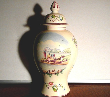
Talking to Ivan Meade he persuaded me to add a symbol to my logo and  since I had an image of a Potiche*** very dear to me, being a family heirloom, on my web site first page he suggested a silhouette of a jar, which soon enough gave birth to others multiplying on my stationery as you can see.
1-16-2011 6-16-39 PM
*** From the Free Online Dictionary:
“Potiche [pɒˈtiːʃ]
n pl -tiches [-ˈtiːʃɪz -ˈtiːʃ]
(Fine Arts & Visual Arts / Ceramics) a tall vase or jar, as of porcelain, with a round or polygonal body that narrows towards the neck and a detached lid or cover.”
The Simon 2010 025

To add even more to this story another Potiche  appeared on my very first post for this blog, so unknowingly a vase in this particular shape began part of Brillante identity from the very beginning.

varie 011
I love how life unfolds at times but I need to stick to the subject so...
Brillante Interiors
It is still me, same approach to interior decoration, styling, photography, just with a better name and more focus on what is my specialty: create atmosphere in interiors and styling rooms adding an European touch but always carefully interpreting and respecting the personality of my clients.

My mantra continues to be:
“ A well designed house is always a good part of a great life
and a beautiful room will make you happy every time you walk in.”

Now it is your turn:
What do you think of my renewed web site? what do you think of my new name?
Comments will be treasured during this exhausting but very exciting transition.

Photography by Albarosa Simonetti

Friday, January 14, 2011

Fornasetti!


“I do not believe in eras or times. I do not. I refuse to establish the value of things based on time.”
Piero Fornasetti
Yes... it was Fornasetti's kitchen the one on my previous post Can you guess whose house is this? and most of you have guessed right, as you can see from the several comments at the bottom of the previous post.
The first one to give the right answer was Jenni from Australia, who describes herself as an amateur of design. Well, congratulations Jenni, you have knowledge and a good eye!
kitchen 02
Here is the kitchen of my previous post with so many clues leading to its famous owners. Strato Cucine prototype kitchen with “Farfalle” decoration, on the floor ceramic tiles “Ultime Notizie” by Ceramica Bardelli and on the wall “Brindisi” wall clock (out of production).
But let's talk about this fascinating house in Milan, which was built by Piero Fornasetti's parents at the end of 1800 and where this poliedric artist, painter, sculptor, interior decorator and much more lived all his life and now home for his son Barnaba who perpetuates the Fornasetti tradition by continuing to create fabulous furniture and accessories.
If you go to Fornasetti website you could also admire more images of this house and find descriptions as the following:
" Like a labyrinth, the house is made up of a complex and intricate network of rooms and corridors.The family home became a canvas for Piero’s fervent creativity and over the course of the many years he lived here the rooms of the Milanese villa became decorated with his art. There is no better, certainly no richer, example of the Fornasetti aesthetic. The home became a testbed for Fornasetti’s work with colour and motif: unique designs, original furniture, found objects and inspirations fill the rooms. Piero’s home became a living archive of his style – the result is an intoxicating, magical experience. The house remains the Fornasetti family home and has been maintained and developed by Piero’s son, Barnaba Fornasetti".
I will name below some furniture and accessories of this house, all designed by the Fornasettis.

yellow room
The colorful  home study of Barnaba Fornasetti, with “Quattro stagioni” on the floor by Roubini Rugs. The desk “Riga e Squadra” was designed by Barnaba and the chair “Moro” by Piero.

bathroom
The most whimsical bathroom I have ever seen with ceramic tiles “Tema e Variazioni” by Ceramica Bardelli. Vase on bathtub by Fornasetti. Rug “Mano” for Roubini Rugs.

living room
Fornasetti designed the tray and the tea-set laying on the rug  “Pavimento” for Roubini Rugs and where the cute porcelain cat happily sleeps, another creation of the company as well as the fabric “Soli e Lune” used for the pillows.
office
We now enter Barnaba Fornasetti's main office at home with the rug “Poliedri” by Roubini Rugs.  Vintage “Leopardo” cabinet, trompe l’oeil “Paggio” on the door and several drawings on the walls are all by Piero, the beautiful floor lamp is a vintage called “Cammei” by  Piero and  the whimsical magazine holder “Luna” was designed by Barnaba .
I hope you enjoyed the short tour and the story of this house, that will probably continue with more images and possibly an interview of Barnaba Fornasetti when I will visit this private house in spring, while in Milan.
To end this tour of a fabulous house, full of inspiration, I will leave you with an image of its enchanting garden.
OUTSIDE - 4
All images used with express permission by Barnaba Fornasetti.

Photography of the kitchen by Guy Hervais, all others by Hugh Findletar.

If you receive this post by Email, and wish to leave a comment, please click HERE and go to the bottom of my post, where comments are.
I love to hear from you!

Sunday, January 9, 2011

Etro style


You may know already Etro as a famous fashion house but this Milanese company, founded in 1968 by Gimmo Etro and still a family business, has also a great Home collection, under the talented guidance of Jacopo Etro.  In an interview he, never a minimalist, said that the philosophy of the collection is to add color to interiors, to surprise and amuse at times even with a funky twist.
Etro style is in fact saturated with colors and imagination, exotic patterns like paisley, pink and lilac mixed with fresh acid greens and yellows, all the colors found in nature, the ones of delicate flowers, the more vibrant spring grass, transparency of shells found on an exotic beach...the Home collection creates four different moods inspired by far away destinations or by a romantic period of the past like Angers which recalls the atmosphere of 18th century.
 Kanpur instead uses vibrant hues like emerald green, hot pink, ochre, gold, Jalor more subtle shades of ivory and graphic patterns in red and finally Ortigia inspired by the sun drenched landscape of the South of Italy and its brilliant colors.

Etro2

01

Etro3 

Etro4

No matter what you choose, pure white linens or jolts of colors in your bedroom
I wish you the best dreams to come true in the morning.


Don't forget to answer to my previous post "Can you guess whose house is this?" clicking HERE.

If you receive this post by Email and wish to leave a comment please click HERE and go to the bottom of the post in the comments section.
I love to hear from you!

Wednesday, January 5, 2011

Can you guess whose house is this?


As I did before, I like to continue challenging your visual memory, this time not presenting a portrait of a famous person but an image of a famous person's house. The featured houses will  be owned by a designer, or an architect, or an artist, so we'll have the opportunity to peek into their private life.
This time we'll start in Milan, where this artist-designer (and more) lived. So many clues in this kitchen, it should be quite easy to identify the geniality behind its design. I will not publish the comments until the end of next week, so keep writing. The first person with the right answer will have an "honorable mention" and of course a link to the Web site or blog.

If you receive this post by Email please click HERE and go to the comments section.
I love to hear from you!

Sunday, January 2, 2011

Brillante's 2011 social media resolutions


I will not check ten times a day my stats!

I will learn more about using Facebook!

I will start to Twit-Twit-Twitter-Twit-Twit (beware you all)!

I will follow more closely my Facebook friends, time permitting!

I will post more frequently and hopefully more of my own projects, so far I am lacking interesting enough photographs. No matter how I design, source, arrange things there is always something I cannot change that clients love and I don't want to show!

I will not comment anymore on blogs that not once have put a comment on mine, even if I did comment constantly on them for two years or more! Don't make me name names...

I will respond to all the comments I receive, either with a comment on the other blog or with a response on my own site!

I will read more posts and be able to comment on more blogs, time permitting!

I will Re-brand my company, name, website, blog, stationery will be different even if maintaining most of the present look, the great team at Meade Design Group is helping me already and I will disclose more about that as soon as the project will be completed!

Excluding the last resolution, already on its way, I should have typed "I will try to..." for all the others, being more realistic.

Is any of the above sounding familiar?
What are your social media resolutions?
 
Clicky Web Analytics