In a country house in Italy I was able to transform an old kitchen into a modern one, still maintaining a Country atmosphere and with a reasonable budget for Interior Decoration.
Before
Two small stoves from the 60's still hooked to a gas cylinder, a wasted corner,
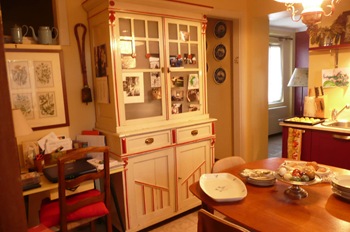
an old cabinet, no counter space.
A very tired and not functional kitchen!
A gas line was installed and a 5 burners gas top (and oven underneath) was ordered, a local stone countertop (not a granite, but a stone with fossils trapped inside and the most beautiful cream colour) was cut to measure.
I chose not to have a standard size kitchen counter but I ordered a deeper than usual one to have more working space and more storage.
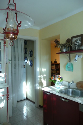
Custom order wood cabinets with a dark, rich red stain (being wood it will be easy to repaint when another colour will become more appealing) were installed and the new dishwasher was also paneled.
In a kitchen, the most difficult part of a house to design, every inch counts and the function of every area is most important. I was able to insert two large and deep drawers for pots and pans, a shallow drawer under the oven to store lids (always a challenge to keep in order) and a narrower, but still deep, pull out recycling system on the side of the sink.
To paint the walls the colour of old style butter was chosen.
I like to create vignettes, so I decided to put art on the wall and use old white ceramic containers for salt, spices, tools and I displayed cooking books on a shelf designed to finish one side of the counter. The soup tureen is Richard Ginori from 1930.
The den beyond the kitchen has the same colour but one wall was painted a deep red, to create continuity.
Lots of action here...as you can see I decided not to use upper cabinets, but only a shelf to display art and objects, in this case a collection of old white milk jugs and a Sheffield teapot.
I placed art also above the sink: an oil painting and precious kids' drawings.
A single, but deep, sink in the kitchen was enough since the old stainless steel double sink, useful to wash vegetables or big pots, was installed in the small room behind the curtain, where there is also the fridge and lots of pantry space.
On a wall a collection of old Spode plates with images of wild game.
A very happy country kitchen, functional but still full of memories of the past.


5 comments:
What a great space Albarosa...it looks beautiful after your thoughtful reno. I love the old teak set!
Best,
Michelle
Just happened upon your blog and had to tell you I love this kitchen! I totally want a corner stove like that! Nicely done
So stunning! I just love your vignettes. It's an art, creating them, I know because I have spent many years learning how to create them :)
Hello !!!!
I love this kitchen !!!!!
Talking about transformation.....!!
Love this blog....!!!!
Monica in Rome
It looks like you really maximized the space that you had to work with. I think the fact that there are no upper cabinets really makes the kitchen feel more open.
I really like the corner stove area -- the first shot of the stove with the flowers & jar of utensils & painting is so fresh and colourful :-)
Kelly @ DesignTies
Post a Comment