Pantone 2011 color
PANTONE® 18-2120 Honeysuckle: this is the color chosen by Pantone for 2011, a color full of life, will Honeysuckle red bring energy in a time of stress? 2010 turquoise represented an escape to the ocean, to exotic places, now we come back to reality with a color that talks about self esteem and good mood, a color that says good-bye to sadness and hello to happiness and energy; get ready to start seeing it everywhere, from high end boutiques to nail paint.
Fashion for Spring and Summer
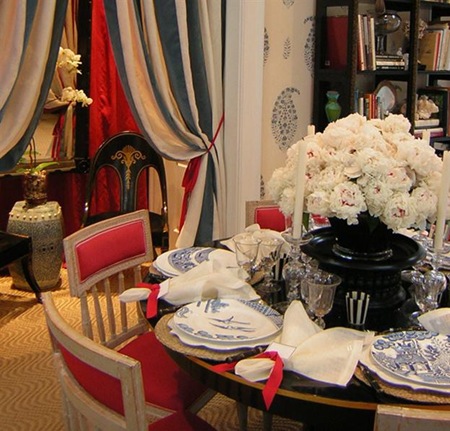
Muriel Brandolini d'Adda, one of my favorite designers, will be happy to use this dynamic reddish pink.
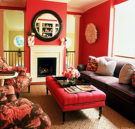
So will be Alessandra Branca, never afraid of colors in her interiors.
Even Sophia looks happy...in a vibrant colored kitchen by GeD Cucine.
Now it is your turn: what do you think about this so called new but to me timeless color?
Have you used it in the past? Will you use it soon?
If you receive this post by Email and wish to leave a message please click HERE and go to the comments section.
I love to hear from you!


8 comments:
I love it.
I knew it was coming, everybody was talking about pinks.
I am particularly glad because I have been knitting a scarf in black and pink..will be in vogue right?
kindest regards mia donna brillante!
NO!!!!!!!i dont like shocking color as PANTONE or pink,i prefer the relaxing and dreaming colors as torquoise.
Adoro questo colore e non vedo l'ora di sfoggiare i nuovi colori primaverili.
Complimenti per il blog.
I'm not a huge fan of pink in general, but I do like the deeper & more vibrant shades of pink. I won't be painting any rooms in my home Honeysuckle, but perhaps it'll make its way into a room or two as accent colour :-)
I totally agree with you Albarosa, and I believe that interiors should be more timeless considering how clients invest in their homes.
I seem to be off trend most the time when it comes to color since I often have to scour the world for fabrics in the right color I am envisioning. In Spring it was an orchid purple, this Summer the right shade of peacock blue. I have even custom-dyed or custom-embroidered fabrics to achieve the goal. But it is not something you can do with many fabrics.
Cheers,
Claudia
thanks for taking the time to stop bye. I popped over to your blog and love your decorations. I'm in love with the new pantone colour and love the references you used :) I did see the movie "I am Love" and drooled buckets for the home ...
Thanks again
I expect that this choice of Pantone will have more success than turquoise - although it was liked by many, turquoise did not get large popularity among producers and designers.
great post! im about to do one on pink too...though i had no idea this was being forcast. I did my Barbados house in coral pink and i have to say its a pleasure to be in.
Post a Comment