Thursday, November 26, 2009

The importance of paths in a house

This is a lovely image but who could sit comfortably on the sofa? can you see what the problem is?
Of course the photograph was taken for a magazine but still...
Have you ever bumped into an open drawer, hit a corner of a cabinet, had a hard time moving around your place with bulky items, finding it hard to pass to the side of the bed when a door is open, hit your head on a cabinet door, while searching for glasses in the kitchen?
The theme of the path in a house is one of the most neglected. When deciding how to decorate a home often we just fall in love with a piece of furniture, a color, a texture but we rarely ask the question: what's happening next. Inside a home, as well as in a city, we always find crossing paths, stops, curves, traffic. A good solution would be to live in a castle and solve most problems! But not everyone can do this and actually problems could also worsen, since having a bigger space most likely will increase traffic and divert it to the areas where we would rather be quiet.
We can see it every day when we drive in our cities: it is not widening the roads that we solve the traffic problem. The only way to solve the traffic problem is to reason about routes and width of the roads, on the types of alternative transportation, the types of movement and travel. In the city, as well as within a shopping center, a school, a cinema complex, an apartment.
How to figure it out? Simple, do what designers do (or better yet call a professional for space planning).

6025494_ab055ee843

Draw a (even very simple) plan of your rooms and draw inside all the furniture or alternatively if you cut pieces of paper in scale, representing your sofa, your table, your bed etc. you can place those cards, instead of drawing.
Once you have placed all the furniture try to see how much space you need to deal with all the doors open, and with all the doors closed. Do not forget windows, drawers etc.
To give you an example: If a square table, card table type, occupies only 32" x 32", furnished with chairs and players occupies nearly 6'7".

hbx-decorating-Berger-1-0709-xlg
But... the poker players, at a certain hour will also rise, passing behind the chair and reaching in the fastest way the fridge or the bathroom.
Keep in mind that a more linear path is less likely to find obstacles along the route.
Consider also that in order to move smoothly with bags, coats, pots, lamps, suitcases, guitars and...at this time of the year... Christmas trees,

5-sendus-1208-xlg-18086193
we need "streets" wide at least 32" same as the doors from which we pass.
Finally, remember that even at home, same as on a road, round curves are always better to manage, especially if we want to preserve hips, knees and head and most importantly if we have little rascals (kids, puppies, husbands?) running around.

livable-living-room-in-a-california-xlg-97740336
Lighting can also help to achieve smoother paths in a home, but I will talk about this in another post. In the meantime have a safe journey around your house!

Image source
Don't forget my "100th post giveaway"... to read the rules click here.

Monday, November 23, 2009

Velvet & Linen giveaway

6a00e554d7b82788330120a6871255970b-500wi
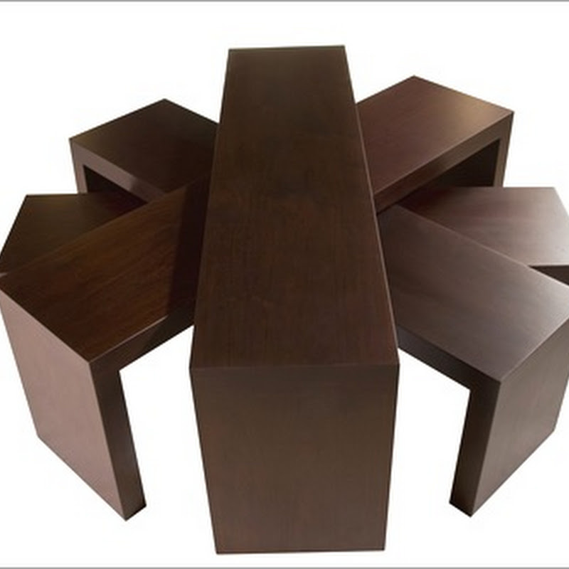
Brickmaker’s coffee table.   Top with waxed rust base.   Size and height may vary slightly.
59” length,  43” width, 17” height.
Mark Sage, owner of BoBo Intriguing Objects and designer of the Brickmaker's coffee table will generously donate three tables as a giveaway on Velvet & Linen blog.
Brooke received 170 entries, meaning pictures of her readers' rooms where they thought the table would look at its best! I said 170 images...overwhelming task...so she asked a selected group of designers-bloggers-friends to help and we all happily put our head into this.
Each of us had to choose 5 rooms where this table would look best, believe me it was a hard decision, then only the 10 rooms with the highest score will be posted today, Monday, November 23 on Velvet & Linen blog.
Three lucky winners will receive the table but Brooke still needs your help, since she now has 10 rooms selected by us, but only three to be chosen, and the final decision will be made by you, readers of our blogs, so please go to Velvet & Linen and vote, you have time until Sunday morning, November 29th, 8:00 AM.
It was great fun for me to look at each image (170) and figure where the table would look best:
creating contrast or blending in?
I will not tell you, because you'll be the judge this time!
Have fun!
If you want to participate also in my giveaway please read 100th post giveaway

Monday, November 16, 2009

A new house for a couple

Have you ever been to London trendiest area, Clerkenwell,
famous also for "White Cube"
Damien Hirst's Gallery?
Well...there is a new home for Moroso and Flos who now live together (happily ever after) to show furniture and lighting perfectly matching and to further promote Made in Italy.
Their new house? a 600 mq. distributed on two levels.
The trait-d' union is Patricia Urquiola, a very talented designer who for many years has created for both brands and who has designed the mise-en-scene, starting from the street windows: "It was necessary to catch people attention, so they will know there is something not to pass by". She also wanted to keep the original space without much alteration, giving a sense of spontaneity to it. White is the dominant "color" also for the steel tubes creating some division in the space.
03-moroso-flos-londra
Sofa "Misfits" by Ron Arad for Moroso and lights "Arco" by Castiglioni (whose picture you could see in the background). The chair on the right is by Urquiola and it was first presented at Salone del Mobile 2009 in Milan (as part of the Fuori Salone "M'Afrique" installation)

Different areas look just like a real house, where the "couple" is ready to entertain.

02-moroso-flos-londra
On the floor Urquiola wanted a PVC carpet with round holes to cover the preexisting floor, a simple solution.
04-moroso-flos-londra
Left: Foreground chair "Bohemian" by Urquiola;
Right: Sofa "Lowlands" by Urquiola and lights "Tab" by BarberOsbergy

09-moroso-flos-londra
Left: Chairs are "Tropicalia" by Urquiola, "Soft Heart" by Arad, "Steel" by Franzolini
Right: light Taccia by Castiglioni and "Il Cubo" a wireless system of light control.


08-moroso-flos-londra
Left: "Super Archimoon" by Starck
Right: on the cables running between the two levels "Parentesi" lights by Castiglioni are alternated with spheres covered in "Sushi" textile by Edward van Vliet for Moroso.


12-moroso-flos-londra
On the left Floor lights by Dordoni and in the center two chairs "Juju" from Sushi collection.

Next stop for the "couple" will be probably Shanghai and Beijing where the two companies are planning to open flagship stores in 2010.
Best wishes for a couple's new house!

You may also like to read:
Lighting by Castiglioni
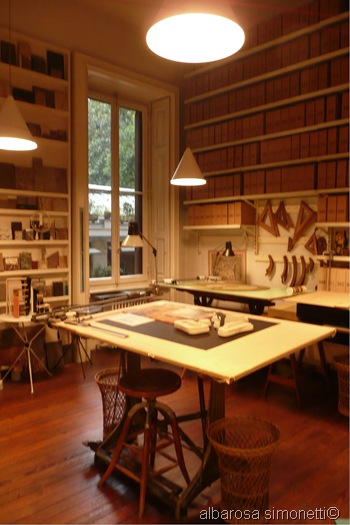
Achille Castiglioni studio-museum
Oh, man it's a ray
Images from AT casa

Don't forget my "100th post giveaway"... to read the rules click here.


Friday, November 13, 2009

100th post giveaway

I would have never imagined, only a year ago, that I would become a blogger, but many things in life are surprising me later so...no big surprise I would say! Today I am writing my 100th post and in the image above you can see in the foreground the "potiche" which appeared in my first one (October 2008).
How did my posts evolve? from the very beginning I was writing about Old and New and without even thinking or knowing it I was presenting more and more posts about Classic and New Italian design. Then someway the idea of designing and leading Italian tours (mostly in Milan and the next one will be for the 2010 International Furniture Fair) landed on me...so now I can see that from the beginning, even without knowing it, my path was bringing me back to my first country.
In all these months of blogging I had not one disappointment but only a huge list of rewards: my readers are growing by the day, comments are always very appreciative and highly appreciated and the networking is amazing. I would have never imagined that through a blog you can socialize, know people virtually, then meet them in real life, make new friends and learn from all.


Picture 021
To all my readers, friends, supporters, mentors...
a BIG THANK YOU, I could not be where I am without you!

Oh! yes... I mentioned a giveaway in the title...and here is the trick to have the treat:
A) You should add Brillante blog to your "Blog list" and become a follower (if not already)
or
B) You should link to Brillante on your blog.

After completing one of these steps you should leave a comment on this post referring to what you have chosen (option A or option B) and you will be entered in a random draw for a chance to win:
a limited edition of this 8" x 12" Black and White photograph

F1000017

valued at CAD 350.00.

The image will be unframed and shipping will be compliments of Brillante, but unfortunately I can offer this only to US and Canada residents.
The winner will be announced on December 18th, 2009.
Good luck to all the participants!
If you want to purchase some of my photographs for yourself or for your clients please send me an email and I will provide you with prices (depending on printing process, edition and size) and a larger choice of images than the one on my web site (click Here) under Photography .

Images by Albarosa Simonetti are ©

Thursday, November 12, 2009

Redecorating for autumn


mutts0006


mutts0005
Too cute!

Images from "Sunday afternoon" Mutts by Patrick McDonnell

Monday, November 9, 2009

Do you remember?

It happened twenty years ago in Berlin!
A few minutes after I posted my previous article on Milan I received an email from Peter Turnley, a great photographer and photojournalist who I truly admire and who always inspire me and I felt the need of passing it to you.

05

Hi Albarosa,
Today, it has been twenty years since the fall of the Berlin Wall. I
wanted to resend a message since a video piece of my images and
recollections that was supposed to run on the CBS Sunday Morning Show
yesterday, is now on live on their website.
CBS:
http://www.cbsnews.com/video/watch/?id=5577929n&tag=cbsnewsTwoColUpperPromoA
rea
A second piece with a text written by myself, and a
portfolio of 52 images can be found on the digitaljournalist site.
Digitaljournalist website:
http://www.digitaljournalist.org/

With warm regards, Peter

Hope you'll enjoy the video and his extraordinary photographs.
This is one piece of the Berlin Wall that I picked up while there, a few months after the event, and brought home with me, just a small piece of history but full of great meaning.
Linda after 002


You may also like to read:
Taking pictures or making pictures
Mary Ellen Mark
and please scroll down to read my other post of the day...

Attention shoppers


La Rinascente, an Italian high-end department store and one of Italy's oldest brand, founded in 1860, recently inaugurated a Design supermarket, home to new trends and the best creativity innovations, in its flagship store in the center of Milan, just across the Duomo.

rinascente design


The sleek interior was designed by architects Claudio Silvestrin & Giuliana Salmaso and allows shop-in shops like Alessi, Kartell, Nespresso, Flos.

rinascente fls


0723design


0723design2


rinascente


Milanesi and tourists can now browse and shop in this sort of MoMA-meets-Walmart where housewares, flatwares, lighting and clocks can be found along with displays of sophisticated dustpans and washbowls, cubes that open into lamps, vases in the shape of grass and notebooks and mugs by fashion designers like Paul Smith. For a moment of pause and relax they can sit in the new café designed by Martino Berghinz, a splash of color in the middle of a minimalist 2,000 square-meter space.

rinascente caffe'


15[1]

and savour some delicious pastries

14[1]


The space feels airy and bright, inviting browsers to touch and experiment.
designsupermarket12


From paperclips to gadgets to select pieces of homewares to a fabulous bookshop specialized in design.

09-big[1]

In keeping with the economy, items can be bought for as little as 9 Euros.
A very democratic approach to design, a fun way to spend a few hours when in Milan.

Images: from Design Supermarket website

Thursday, November 5, 2009

Lighting by Castiglioni


Did I catch your attention? Well...now you have to read the whole post!

A legend of Italian design, Achille Castiglioni is famous also for his lighting and one thing his daughter recently pointed to me (see my previous post on Achille Castiglioni Studio-museum) is that he always remained faithful to Flos. He was a designer and a gentleman who believed in creating and maintaining a deep relation with one company, instead of jumping to the best financial opportunity.
Designed by Achille Castiglioni and Pier Giacomo Castiglioni for Flos in 1962, the Arco Lamp (above) is one of the classics of modern lighting design and is part of MoMA's permanent collection. This iconic lamp was created only and exclusively for a table, since it is an overhead lighting which does not require ceiling suspensions, even if now showrooms and advertisements position it near sofas or beds. Castiglioni instead was very specific about the function of his creations and he even used to go and talk to vendors to explain it. You all know that the lamp has a base of marble and probably some think that the asymmetric hole in it is only a pleasing aesthetic detail...but...the genius thought that 65 Kg. of marble cannot be easily moved around so, practical mind as he was, he thought that in every house there would be a broom with the exact handle diameter...inserting it in the base allows two people to move the lamp easily.
How clever and functional could that be?


Another iconic lamp, designed by the duo the same year was Taccia and the key design factor was to make the light functional by making it adjustable. Its style is very unique.
Estate 2009 442


Cocoon was created spinning an American new fiber (which was then used to cover boxes of firearms) the same way as cotton candy. Fun!
t_FL-TARACOCOON


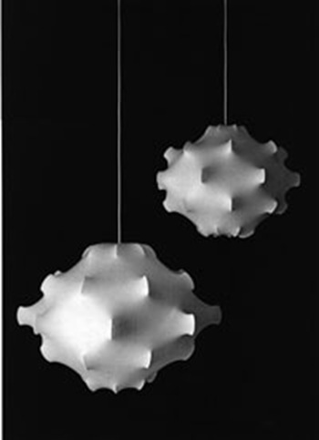
1988 Taraxacum is beautiful when ON, beautiful when OFF and it can hold from 60 to 200 bulbs.

11-1-2009 2-35-30 PM


Giovi takes its name from his daughter Giovanna and again it is an ingenious interpretation of a portable device for drinking when traveling, which he bought for a few Liras back in the '70s (as he used to say of found objects: " Put it there, ideas will come"). The original object made of thin metal consists of two parts attached with short screws that allow the flat object to become a cone.

11-5-2009 4-44-18 PM


Diabolo has a hidden pulley which allows to change the height of the light.

11-5-2009 4-51-41 PM

you can see more Diabolo below, in one of the photographs taken at Castiglioni studio-museum. with a special permission from La Triennale, just for you, my readers.

Estate 2009 446


11-1-2009 2-40-11 PM
Grazie Achille!
You may also like to read:
Achille Castiglioni studio-museum

Wednesday, November 4, 2009

Sweet and sour clients


On the left I smile...I have new clients!
On the right I am disappointed ...I have lost them!
I have another question for my blogger friends who are also designer:
Do you meet clients on week-ends and/or holidays? If so do you charge more for your time?
I was approached recently by potential new clients who wanted me to have a consultation on a Saturday. I did agree, saying I don't usually work on week-ends but since they both work full time I could make an exception for this Saturday. Then they moved the appointment to the following week, on a holiday, again I said I would make an exception but I stated that if it would happen again I would be charging a 20% more (I know designers who charge 100% more). They came back to me saying we were "not a good fit" to work together (I guess they were right...we are NOT a good fit)
I wished them good luck for their project.
Even if I do work a lot on week-ends for projects (ideas, drawings, research from the comfort of my home) I feel it is inappropriate to let clients take advantage of my free time and as a form of respect to each other I believe we should all stick to some rules and don't undersell our services since doing this will hurt the whole industry.
Would you call your lawyer for an appointment on week-ends?
Would you call a plumber during a week-end and not expect some surcharge?
Would you call your seamstress to work on a Sunday?
Would you (please fill the blank)...?
Would you please tell me your stories?

Image: Fornasetti vases

Sunday, November 1, 2009

Pillow talk with Joni

Estate 2009 476       

Joni of Cote de Texas has a post on pillows which inspired me to ask a question:

Why (most) men don't like (decorative) pillows?

Is that because men think they are more practical and less frivolous than us ?
Is that because pillows may suggest intimacy?
Is that because they are too lazy to remove them before going to bed?
Is that because we scream when they squeeze them or throw them on the floor when watching TV?
Is that because...?
Could you please tell me why?

 
Clicky Web Analytics