The first to say that turquoise would be the color of 2010, back in November, was Pantone and precisely the shade "Turquoise 15-5519".
Motivation? "It carries us in an exciting tropical paradise, while offering a sense of protection and shelter from stress," says Leatrice Eisaman, executive director of the Pantone Color Institute. "Combining the serenity of the blue with the energetic aspects of the green, turquoise reminisces of the waters of the sea, renewing our sense of well being".
Ancient and contemporary at the same time the color turquoise, with its positive charge and magic, colors today Valentino's shoes and in the distant past the eyes of Egyptian women. Moleskine ® also sells its charm: one version of the notebook-icon has a turquoise cover. Motivation? "It carries us in an exciting tropical paradise, while offering a sense of protection and shelter from stress," says Leatrice Eisaman, executive director of the Pantone Color Institute. "Combining the serenity of the blue with the energetic aspects of the green, turquoise reminisces of the waters of the sea, renewing our sense of well being".
Success across the centuries from fashion to interior design to costume.
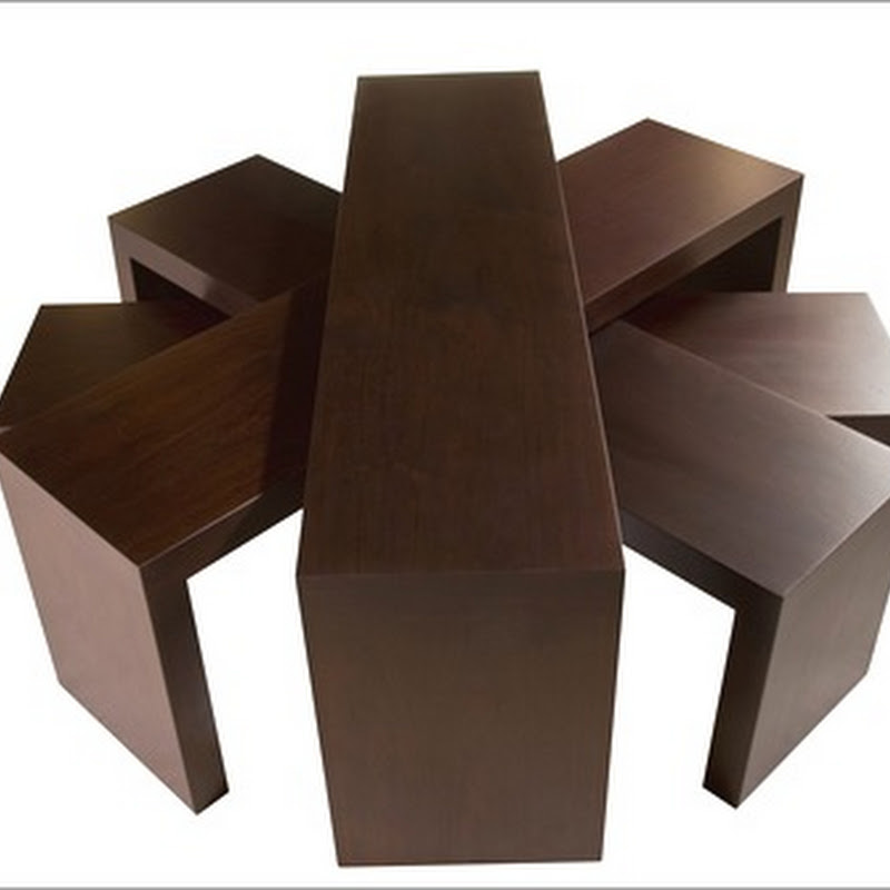
The secret? Maybe because power has always been attributed to the turquoise stone and its color. Talismans in ancient Egypt where made of carved turquoise in the shape of scarabs, believed to protect and give strength. The stone was considered sacred also by the American Indians, for its power to mediate contact with the supernatural. Precious or frivolous, traditionally turquoise creates serenity, protection from danger and ability to communicate. Chair Louis Ghost by Starck for Kartell, two wooden Asian stools, but mostly a fabulous turquoise.
Available in turquoise also a classic-outdoor: The "Re-trouvé 566" designed by Patricia Urquiola for Emu. The chair, characterized by complex pattern of repeated lozenges, when colored in blue immediately takes on an exotic appearance.
Another chair by Urquiola, "Frilly" for Kartell.
Blue, aqua green, turquoise to be matched to the natural tones of cashmere in the new house collection of Loro Piana.
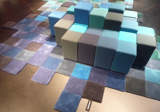
Playing on shades ranging from blue to turquoise is the carpet designed by Ron Arad for Nani Marquina, clearly inspired by the sitting arrangement designed by him for Moroso.
In a bathroom pale turquoise like aqua color is always a winning choice.
Japanese bowl
"Mademoiselle" by Kartell, a splash of color in a classic interior.
Timeless chairs from Chinoiserie Chic beautiful blog.
Turquoise color is the key factor for this simple arrangement of furniture.
An image from my previous post The art's lady , a fascinating house in Milan where this color is widely used.
And if you like turquoise you will love Erin's "House of Turquoise"
Here are some of my favorite pictures taken from her blog
And finally an unusual combination of turquoise and different shades of blue: the image is presenting an interior by Tobi Fairley, featured on the latest issue of House Beautiful (Tobi has also the honor, well deserved, to be on the March magazine's cover).
Talented and beautiful Tobi was in Vancouver last summer and I wrote a few posts about her visit, see here and here.
Isn't this an amazing dining room and a stunning chandelier?
Back to the color...
Turquoise, in any shade, is such a versatile color that works well with almost every other color, actually at the moment I cannot think of anything clashing with it, if depth and undertones are chosen carefully it is always a good marriage.
Do you have a favorite matching color for turquoise?
Is there any combination of turquoise and another color you don't like?
I would love to hear from you!


7 comments:
Wonderful!It is really amazing to see how a simple color can inspire such beautiful interior decoration. Using turquoise wallpapers for walls was a new concept. I liked them.
Love it with lime.
Nice post Albarosa
My favourite colours with turquoise are purple and bright green. And turquoise looks FAB with black & white zebra print!! As you said, I don't think there's any colour that doesn't look good with turquoise :-)
For me, turquoise represents freshness, happiness, water, and summer and all the good things that go with it :-)
Kelly
I definately think I personally like turquoise more as an accent colour in limited amounts than say a whole room painted in it. For me, toning it down with neutrals such as purpley greys seems to work.
Thank you sweet friend for including me in your gorgeous post on turquoise!! I miss you and hope to see all my gals in Vancouver soon!! xoxoxoxoxo Tobi
I love turquoise but so far have only used it in kids rooms or bathrooms...I cannot resist turquoise glass mosaic tiles.Seeing your post. i might experiment with more rooms.I so wish i were in Vancouver ...I will be glued to my TV very soon, not missing a minute of the Olympics
I love turquoise. To me it is a timeless color. It never goes out and works with almost everything!
Post a Comment