Let's start from the beginning...
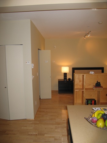
In this first picture you may notice a blah room with an awful track light and by-fold doors,
the furnishings look very basic and the fruits very fake.
This room actually could well be a budget hotel room but instead it was an apartment staged at the cost of $ 5,000, freshly painted in the most depressing brownish green and furnished... well... you see it by yourself. Would you like to see how it changed?
This is the same angle as above, after I moved in and started to decorate it. The very first thing I did was to paint the walls in a beautiful Smoky green, by Benjamin Moore.
Benjamin Moore Smoky Green CC-700
At the end of the so called corridor a focal point created by an antique oil painting and an antique secretaire gives the impression of more depth.
Some objects I love to display on the secretaire.
This is Martino, my loyal keeper of hats and Geronimo's leashes. Needless to say I had to be very careful with every inch to have enough space for walking, moving furniture, entertain. Luckily it is my profession and we do this for clients all the time, using the space as best as we can. The flow is great.
Let's rewind for a moment.
From the bed to the living area before, cold and uninviting as it can be.
Fast forward.
I love the energy of the orange and the pillows are made of a luxurious damask silk, instead of that useless screen I hang hazelnut silk drapes.
The bathroom as it was before, isn't a weird way of using a wall?
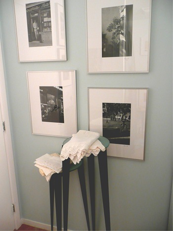
Don't you think art looks better on the wall instead of towels? and the two silky turquoise curtains make me smile every morning. The small table with an aqua glass top is one of three from a previous house.
Another wall in the bathroom with my photography displayed.
I love pure linen towels, they dry easily and it is a wonderful feeling using them.
My bathroom is full of framed photographs but as long as I keep an eye on the matte for signs of dampness I know they are safe.
This project as you can see is still in progress, I will add a ceiling light over the bed, I have my eyes on something on 1stdibs, I need new window treatments, change the fireplace front and oh! so many things so little time.
In Italy they say the shoemaker does not have shoes, is there anything similar in English?
Next time I will show you where I work and socialize, in the meantime I would love your comments:
What do you think of the transformation? Comments please!
If you receive this post by Email and wish to leave a comment please click HERE and go to the comments section.
I love to hear from you!
Photography by Albarosa Simonetti


9 comments:
Albarossa this is a magnificent transformation. Dod you seal off the bed area with the bookshelves?
Great transformation. I can't believe the first room even cost $5000.00. It kind of looked like a student dorm. You took a 1 star hotel room look and made it 5 star! I love the use of the book shelves as room dividers / walls. Very effective. Congrats.
Lovely. And, I , too love framed artwork in the bath.
Amazing transformation. More is definitely more. Thanks for showing that the tiny "corridor" space can be so beautifully functional.
You have brought amazing warmth and character to the place, Albarosa! Well done!!
Quite a transformation. The bedroom division with the bookcases and drapes is great especially since you have books on both sides. What better than being surrounded by books and art (I assume you might have some small ones also hanging from the book shelves or inserted among the books) while in bed.
I am curious about why the secretaire is put on an angle, it is because of the size of the painting behind it? And about the way you have the b/w photographs arranged on the wall. I think one of your photographs enlarged to the size of the painting behind your bed would be fantastic.
In any case, it was a treat to see your place, and can not wait to see what you have done with the rest of the space. I am certain that most of us understand that a home is never finished and to keep it alive it will have to be in perpetual transformation. We enjoy taking the trip with you. Thank you Albarosa.
Absolutely wonderful! Inspiring!
Can't wait to see the rest of it!
What fantastic collection of photography!
What a transformation! Love the double-sided bookcases.
Cheers,
Claudia
Post a Comment