Monday, September 27, 2010

I love Opera, do you?


If you love Opera, Symphony, Ballet, you must love Teatro alla Scala and now there is
a new Hotel to love, called Milano Scala.
The project by Cibic&Partners is located in the Brera area, in the center of Milan, a few steps from the world famous theatre. An existing building, from the end of XIX century, was renovated creating 62 rooms, each different from the other but all with the common theme of Opera lirica. You can have meals at the restaurant "La Traviata" and choose the bedroom suite "Il Barbiere di Siviglia" or the Suite "Carmen", the Suite "La Boheme" or another favorite subject, all bedrooms will have some blown up images related to La Scala performances.
I can spot Maria Callas below, on a swing.

hotel-scala-04

hotel-scala-06 

Not much privacy here though...
hotel-scala-12

I love the use of the "Rosso Scala" color as an accent and for the luxurious drapes, the same color used for the velvet chairs in the theatre.
hotel-scala-07

The grand Lobby with glass ceiling and ethereal ceiling lights by Moooi.
hotel-scala-01 

It is a gorgeous Hotel but it is important to note that this is also a Green Hotel, because the project was carefully studied to permit eco-sustainability, great insulation, they even excavated underground to be able to heat and to cool the building with a sophisticated technique using ground water. The rooms of course are lit by LED lighting, the bathroom accessories are all biodegradable, faucets and toilets have water saving devices and even the paper used in the hotel and for advertising is certified by the Forest Steward Council.  For mobility they offer hybrid courtesy cars and since Milan has a very efficient service of bike-sharing, called BikeMI, you are assured that even if in a luxury hotel your footprint is kept low.  

hotel-scala-05

hotel-scala-11

hotel-scala-03

hotel-scala-10

hotel-scala-08

hotel-scala-13
Finally a beautiful terrace to enjoy a break, drink a Rabarbaro Zucca and  look at the
360 degrees view of Milan, weather permitting, of course.
hotel-scala-14 

Now tell us...do you love Opera, symphony, ballet?
What is your favorite piece or your favorite composer, dancer or singer?
Images source
If you receive this post by Email and wish to leave a comment please click HERE and go to the comments section.
I love to hear from you!

Friday, September 24, 2010

The joy of autumn


After a few months of sunshine, roses in full bloom and blue sky, rain is coming, leaves are falling, fireplaces are lit and...Art Galleries  are putting up their best faces. Autumn is the best time of the year to get interested (again) in art.

varie 015
A few days ago I went to Bau-Xi gallery in Vancouver, for an interesting lecture and the opening of a new exhibition of a dear friend, Jamie Evrard, a very talented painter and a warm, fun, smart lady (I should say girl, because she is full of enthusiasm, curiosity and joie de vivre like a teenager or better yet like a child).


varie 023
She talked at length, and we all wished she talked longer, about the house in Tuscany where she spends a few months a year enjoying the tranquillity of the countryside and painting still life all day between long walks and long meals at neighbors houses.

varie 004
but let's hear what Jamie said:

Pentimento, the title of my show, is an artistic term meaning “the reappearance in a painting of an underlying image that had been painted over (usually when the later painting becomes transparent with age)” .
This talk, too, has something to do with the idea of Pentimento or seeing layers underneath the surface, as I have put it together by reading over my Italian diaries of the last 16 years, discovering forgotten events and feelings, selecting, deleting, and deleting again, trying to discover the trajectory, if there is one, of my last 16 years in Tuscany. I have tried to distill from hundreds of pages of diaries a selection of snippets which have made up my life in Italy: its pleasures, doubts, joys, lonelinesses, friendships, misunderstandings, tastes, laughs and sorrows.

varie 003
 and here is when she talked about the first encounter with that charming house:

We walked down a grassy carpet along the wall, turned right under a huge fig tree and continued down some ancient rocky steps with mossy grass growing between them.
Opening the ancient heavy double doors with the key we had been sent we went in. The first thing I saw was a bowl, all white, containing three pears and an apple sitting on a trunk covered with an old rug. Not a perfect apple, but one that looked as though it had rusted, and the smallest perfect golden pears. What about my first fascination being with this bowl of fruit and not the house itself. Perhaps the white bowl was a metaphor for the whitewashed empty rooms of the house, a beautiful simple container to set off whatever one would put inside it; a place for imagining. In any case, my instantly falling in love with a simple bowl of fruit was certainly a preview of what was to become my work of the next many years: painting still life in Italy. (...)

varie 006
A six hundred year old parish house has become in many ways the touchstone of my art making, for it is there in that quieter place that I have time to really stop and consider both my art and my life.
(...)  Standing here painting by the window of a darkish room, trying to convey what I see in watercolour suddenly seemed like a crazy thing to do. It would be hard for most people to understand why anyone would travel halfway around the world to a place where bed sheets need to be washed by hand in the tub in order to paint the shadows on an eggplant. Well, I’ve made my choice, and that’s what I’ve done.

varie 005

In the Fall of 1999 Jamie wrote in her diary:

What an orgy of colour in the landscape. Probably any normal person would have seen green forests and fields and noticed that the afternoon was cloudy.  To us, everything seemed tinged with purple. Weeds are going to seed--Queen Ann's lace has purple spent flowers, many plants have purple stalks, the green of the forests calls for its compliment. Grapes of deepest blue with vines which are only now beginning to turn gold. Looking down into the valley in the dusky light even the far off mountains are purple.

Only a painter can write such a vivid description of nature's beauty.

varie 035
Many of my friends were at the opening and among them Interior designer and blogger Patricia Gray and writer and blogger G.S. Sirotnik (with a very appropriate scarf...)

varie 029 
Florence Roberge, a painter, who often travels to Tuscany with Jamie to find inspiration for her art.

As you can see autumn has arrived with an explosion of colors.

Photography by Albarosa Simonetti
If you receive this post by Email and wish to leave a message please click HERE and go to the comments section.
I love to hear from you!

Wednesday, September 22, 2010

A Brillante project


Let's start from the beginning...

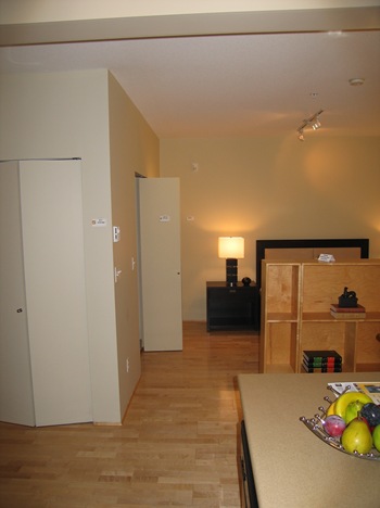
 kitchen2
In this first picture you may notice a blah room with an awful track light and by-fold doors,
 the furnishings look very basic and the fruits very fake.
bed 
This room actually  could well be a budget hotel room but instead it was an apartment staged at the cost of $ 5,000, freshly painted in the most depressing brownish green and furnished... well... you see it by yourself.

Would you like to see how it changed?

This is the same angle as above, after I moved in and started to decorate it.   The very first thing I did was to  paint the walls in a beautiful Smoky green, by Benjamin Moore.
smoky89628 
Benjamin Moore Smoky Green CC-700

It is a bit of a funny color because even though it is officially called green it actually "reads" blue when you put it against white, has only green and grey undertones so the name could be deceiving and most of the time, depending on the light of the day, it can become a gorgeous robin's egg blue tone.  As cooler colors expand visually the space I thought it was a great choice for a small apartment and I assure you it is also a very relaxing color.

The Simon 002

The bed  was then hidden by two great bookcases, deep enough that I can have books on both sides, designed by Neils Bendstedt for Inform Interiors, Vancouver. As you can see I have created a sort of corridor from the kitchen area to the bedroom even if in fact there is no bedroom, since it is in an open space apartment with a lovely patio which I will show you in another post.

 The Simon 005
At the end of the so called corridor a focal point created by an antique oil painting and an antique secretaire gives the impression of more depth.

The Simon 006
Some objects I love to display on the secretaire.


Martino
This is Martino, my loyal keeper of hats and Geronimo's leashes. Needless to say I had to be very careful with every inch to have enough space for walking, moving furniture, entertain. Luckily it is my profession and we do this for clients all the time, using the space as best as we can. The flow is great.

Let's rewind for a moment.


fireplace2
From the bed to the living area before, cold and uninviting as it can be.

Fast forward.

copy
I love the energy of the orange and the pillows are made of a luxurious damask silk, instead of that useless screen I hang hazelnut silk drapes.

Estate 2009 402
I never liked headboards and rarely had one so I hung a big oil painting instead, at the perfect height to be able to read in bed without touching it. I also have small oil paintings on each side of the bed, made by my mother after some of our trips, the one here has Hawaiian  Plumeria as a subject.


Bath
The bathroom as it was before, isn't a weird way of using a wall?


 The Simon 2010 027
Don't you think art looks better on the wall instead of towels? and the two silky turquoise curtains make me smile every morning. The small table with an aqua glass top is one of three from a previous house.


The Simon 2010 039
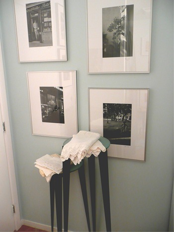
Another wall in the bathroom with my photography displayed.
 I love pure linen towels, they dry easily and it is a wonderful feeling using them.


The Simon 2010 034
My bathroom is full of framed photographs but as long as I keep an eye on the matte for signs of dampness I know they are safe.

This project as you can see is still in progress, I will add a ceiling light over the bed, I have my eyes on something on 1stdibs, I need new window treatments, change the fireplace front and oh! so many things so little time.
In Italy they say the shoemaker does not have shoes, is there anything similar in English?
Next time I will show you where I work and socialize, in the meantime I would love your comments:
What do you think of the transformation? Comments please!

If you receive this post by Email and wish to leave a comment please click HERE and go to the comments section.
I love to hear from you!

Photography by Albarosa Simonetti

Monday, September 20, 2010

Elle Decor apartment


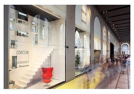
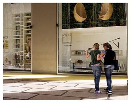
This time...again? you would say... we travel virtually to Milan where a stunning project by Italian Elle Decor magazine of an installation of a complete apartment, 13 rooms on two levels, from the entrance hall to the garage and the laundry has taken the space of all the eight huge windows at La Rinascente, the biggest department store in Piazza del Duomo, Milan.
A project by the famous Interior design magazine to mark the opening of the new department of Casa (Home) which will take a whole floor at the store.
The extraordinary installation by Elisa Ossino and Andrea Garuti creates the illusion of a real house, since they mixed real pieces of furniture with photographs of objects and people on the scale 1:1 where he sets the table, she takes a nap, the child plays, a real life representation of a house completed with sounds of birds on the terrace, an alarm clock in the bedroom, a washer running in the laundry.

elle-decor-apartment-at-rinascente-milan-L-2
Some windows of the famous store under the arcades of Corso Vittorio Emanuele.

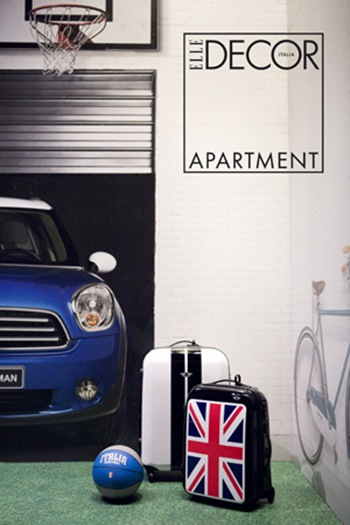
Elle decor
The garage...is this a Mini?
I would have preferred to see a Fiat convertible 500, but who am I to judge?

Tulip
Tulip, the gorgeous statement chair designed by Marcel Wanders for Cappellini is also on display.

Paperblog
The interesting project by Elle Decor was to represent a house where you live well, because
a good house is a great part of a good life.
I can't agree more!

If you receive this post by Email and wish to write a comment please click HERE and go to the comments section at the bottom of this post.
I love to hear from you!

Saturday, September 18, 2010

Question of the week


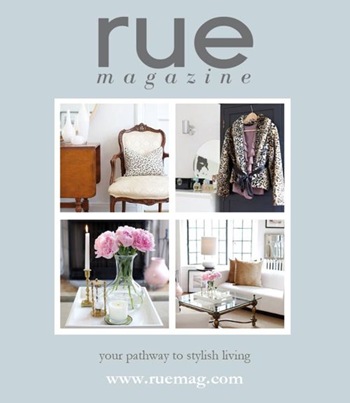
Do you Rue? is the question of the week.

Well, I am probably the last one to talk about the "much talked" new online magazine Rue, but I am really excited about it...
dividerissue1
6a00e55225716d88330133f4378894970b-800wi
Virtually flipping from page to page I saw many familiar faces whose blogs I am regularly following, even from their very first post for some, so at Rue I feel at home with my virtual friends:

I saw Heather Clawson from Habitually Chic, I virtually follow her every week around New York and learn what is new, what is happening there from a chic insider.
I saw Grant K. Gibson from the eponymous blog, a great designer from San Francisco who will soon be part of  the first Elle Decor Showcase House in his own city.
I saw Tobi Fairley, who I not only admire but who I met in Vancouver in real life two summers ago (I have two posts on her) thanks to my friend Ivan Meade.  She is a talented Interior design but she also has a great, warm personality. 
I saw Ronda Carman from All the Best super refined blog, which I read regularly, enjoying her interviews, her style, tips on travels, her recipes.
Finally I saw Vicente Wolf, an icon whose blog I follow to learn from him everything I can and to enjoy his extraordinary view of the world of design.

Rue is a fresh, innovative magazine, full of ideas and great images so if you did not subscribe yet, please do it today so you will enjoy every issue the moment they hit the stand, oops, the screen.
RueMag2
Congratulations to the bloggers who created the magazine, Anne Sage of The City Sage and Crystal Gentilello of Plush Palate (The only Italian thing in this post is perhaps the Italian sounding surname of Crystal...is that enough?) and thanks for a new way to stay informed and entertained.

I have to say that paper magazines are still my best friends but it is good to have different options, that is why I also love to check for quick references some of my favorite magazines on their online version.

ruemagbando
Let's celebrate Rue while keeping reading on paper too.


Images bluntly stolen from their blogs

Tuesday, September 14, 2010

In conversation with...Albarosa Simonetti


Can you believe it?
Iván Meade, principal of  Meade Design Group has just published an interview with me on his blog (please click here if you want to read about me).

He already interviewed  many of my favorite designers for his blog, from Barbara Barry, Brad Ford, Michael Devine, Kelly Wearstler, Brooke Giannetti, Vicente Wolf, to Canadians Kimberley Seldon, Omer Arbel, Patricia Gray, to only name a few.

Now you may know why I feel so honored and thrilled that he asked me to be part of this group of truly talented and successful designers but I also need to tell you that it was quite an experience on a different level, we live our day working, creating, socializing, relaxing but sometimes if someone asks you "How did you start?" or "Where are you leading to?" then we are forced to stop and think.
With Iván's well posed questions I had to pause and reflect, I had to go back in time when I was a child going to Museums with my father, admiring my mother's skills as a painter, helping my sister often moving furniture around our house, I had to think about what I accomplished so far and what my legacy will be.
It sounds easy but it requires a lot of introspection and slowly your life becomes more clear.

I am so thankful to Iván, not only an extraordinary Interior designer and artist, but a wonderful person too, for giving me this opportunity to be recognized as an Interior decorator and photographer but also to make me reflect on myself and my business.


Brillante Website
Image by Albarosa Simonetti

Please go to his Website and enjoy his beautiful Blog, always full of stylish ideas, creativity, eye candies, interviews, design projects, art and more.


Image by Andrea Seraphim

Thank you, Iván.

If you receive this post by Email and wish to leave a comment, please click here and go to the comments section.
 I love to hear from you.
 
Clicky Web Analytics