Milan (or could it be New York?)
A basic scheme of colours, white as milk, brown as cocoa
and a dramatic (not for the unfit...) set of concrete stairs to link three levels
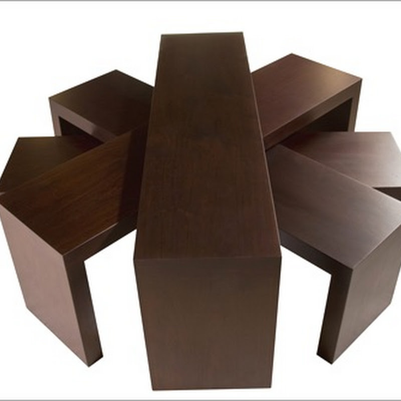
White is used also for the concrete floor for a minimalist approach, all furniture is custom designed
Refreshing colours, clean lines for the bathroom
Another view of the stairs and a glimpse of the owner's collection of contemporary art.
A beautiful Loft, an interesting Project by Alessandra Badoer
Photography by Cristina Fiorentini


6 comments:
Stunning! I wish we didn't have all that code in Canada - I would love to have those concrete stairs in my home.
What a beautiful loft. The stairs are gorgeous...but wouldn't want to try to navigate them after a few drinks!
The concrete stairs are totally cool. I would hurt myself on them every day if they were in my house, but they're sure nice to look at!!
Great use of space the way the kitchen is tucked under the staircase.
Kelly @ DesignTies
Yes...the stairs are gorgeous and at the same time highly dangerous. I have vertigo just looking at them, but they are definetely a big statement in this loft.
I love the stairs Albarosa! Ivan's right though, code is so strict here with handrails and such...even nosings!
I love the way the interior elements all relate to each other, and seem to wrap around other functions.
This loft is so Italian, and so beautiful! I'd love to live there.
Cool loft...but I'm a bit freaked out like some others on the stairs...I'd have to go up and down on all fours...
Post a Comment