Friday, October 29, 2010

A house between past and future

Past and future cross their paths in this house in Liguria, an Italian region I am particularly attracted to, having spent many summers there. The project is by Arch. Marco Ciarlo who was able to merge two distinct houses, one from the 1600's and one more recent, into one. The house has, of course, many different levels due to the slopes of the property but the result is a fluid connection between rooms, using existing steps and entryways or creating new ones.
The past is represented by original antiques mostly from the 1700's and the 1800's, collected by the owner, whose passion is art and design, the future can be found in avveniristic shapes of contemporary design and lightings.

casa_borgo_ligure_02
Hot pink chair, pale blue vintage umbrella vase from the '50s 
and contemporary painting on the wall.


casa_borgo_ligure_04
Big Easy chair by Ron Arad
A 1700's wooden statue, a cast iron chandelier, a vivid blue Big Easy chair by Ron Arad and white stools designed by Ciarlo create tension and interest with soft rounded lines and more clean and graphic ones.


casa_borgo_ligure_11
Another view of the same room with the original fireplace.


casa_borgo_ligure_12


casa_borgo_ligure_03
Tolomeo lamp by Artemide
In the library  there are several inexpensive bookcases, a large table to read and work and the Tolomeo floor lamp by Artemide designed by Michele De Lucchi more than twenty years ago and still so modern.


casa_borgo_ligure_08
The adjacent bedroom with antique furniture and a large 1500 oil painting.


casa_borgo_ligure_06
The library is also connected, with an unusual step, to the dining room.


casa_borgo_ligure_05
The kitchen is quite simple but very functional and it was decided to create it
at a lower level than the living area.


casa_borgo_ligure_07
Liberty style windows and glass vases from 1700 are in the oldest part of the house,
with a classic and elegant marble staircase.


casa_borgo_ligure_13
A grand entrance with steep steps worth climbing to reach a
large flat garden where this beautiful house sits.

Photography by Alberto Piovano

If you receive this post by Email and wish to leave a comment please click HERE and go to the comments section.
I love to hear from you!

Tuesday, October 26, 2010

Selezioni Innovative Stone Design

                                                               Selezioni innovative stone design

If you want to have stunning pieces of 3D marble or innovative stone surfacing in your home look no further, Selezioni Innovative Stone Design is a company based in Vancouver with the greatest selection of textured stones. Marta and Marco Rocca are originally from Milan and I am so glad that they are now back in Vancouver with their stunning products.

Selezioni Innovative Stone design
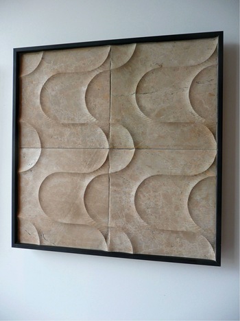
Luxe series by Selezioni stone design

Selezioni Innovative Stone design6
Luxe series by Selezioni stone design

"The Luxe Series highlights various design influences from classical to contemporary."


Selezioni Innovative stone Design2
Techno by Selezioni stone design

"An avant-garde collection highlighted by distinct shapes and sinuous curves."


Selezioni Innovative Stone design3
Dunes by Selezioni stone design

Selezioni Innovative Stone Design7
Dunes by Selezioni stone design

"Inspired by the natural movements of sands in the great deserts"


Selezioni Innovative Stone design8
Decora stones by Selezioni stone design

"Decora Stones are sculpted from a selection of marble and guilded to highlight the modernist designs."

From Selezioni website:
"The experience that Selezioni brings to its’ innovative stone surfacing enhances the natural stone materials with new dimensions in textured finishes. Ideal for feature wall applications in residential settings such as entry hallways, corridors, fireplace surrounds, bathroom areas and spas".


Selezioni Innovative Stone Design5
Selezioni stone design showroom

Marta and Marco Rocca in their elegant showroom.

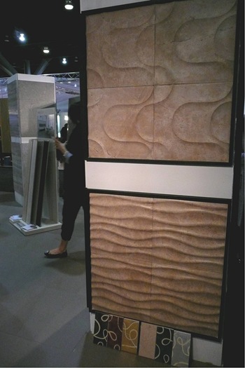
Their products were also displayed at the latest IDSwest at AEON's booth.

IDSwest 2010 Selezioni
 Selezioni stone design at IDSwest 2010

IDSwest 2010 Selezioni 2
Selezioni stone design at IDSwest 2010

Take a look at their website HERE and enjoy the beauty of their creations.

Photography © by Albarosa Simonetti

If you receive this post by email and wish to leave a comment please click HERE and go to the comments section.
I love to hear from you!

Friday, October 22, 2010

Final report from IDSwest 2010, Vancouver

Brent Comber design at IDSwest

This is the final report from IDSwest, Vancouver, with some brief encounters of
interesting people and great products:

IDSwest Sarah Richardson
Sarah Richardson and Tommy Smythe at IDSwest
Our famous Sarah Richardson talked at length about Interior design and if you want to know more just read the post that Marcus Design wrote (Nancy was sitting near me, first row, not to miss one word, one gesture of this so well loved designer)


IDSwest 2010 Origins
Marie Khouri at IDSwest

I met for the first time Marie Khouri, a talented sculptor who presented at IDSwest these beautiful organic pieces in a landscape installation called Origins.


IDSwest Marie Khouri
Marie Khouri design at IDSwest


Who does not know Martha Sturdy gorgeous objects and paintings?


IDSwest 2010 Martha Sturdy 2
Martha Sturdy design at IDSwest

IDSwest  Martha Sturdy 1
Martha Sturdy design at IDSwest


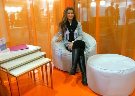
Tina Dente from Bloom Furniture Studio posed for me with their new line of furniture from Italy: Pedrali


IDSwest 2010 Bloom 4
Pedrali for Bloom at IDSwest

IDSwest 2010 Bloom 1
Pedrali for Bloom at IDSwest

 And finally two talented Vancouver designers, Patricia Gray and Judith Latowski celebrating new inspirations and exchanging ideas at the fun Breeder Bar.

IDSwest Patricia Gray and Judith Latowski
Patricia Gray and Judith Latowski at IDSwest

Cheers to a great event and see you all next year at IDSwest 2011.

Photography © by Albarosa Simonetti

If you receive this post by Email and wish to leave a comment please click HERE and go to the comments section.
I love to hear from you!

Wednesday, October 20, 2010

Karim Rashid at IDSwest, Vancouver

Karim Rashid at IDSwest, Vancouver

When I was at the talk that Karim Rashid gave at IDSwest, Interior Design Show West, in Vancouver, I found he was able to elaborate on many ideas I already had in my head in a more basic form.  His philosophy resounded with me and I use this term to describe what he said because he is a thinker and a brilliant mind. I will try to briefly communicate his thoughts to you, but bear with me because it is not an easy task to write a few lines out of more than an hour talk so full of content and dynamism.

IDSwest Karim Rashid 6
Karim Rashid at IDSwest, Vancouver

René Descartes, in Italian Cartesio when I studied philosophy in Milan, French philosopher of the XVII century, considered the father of modern philosophy, was cited by Rashid when he said that we have created a Cartesian world, but since in nature a straight line does NOT exist Karim Rashid created his objects and furniture with fluidity in mind, he thinks about us as amorphous creatures and he wants to create an amorphous world. A word he used to describe this was blobject which instantly connects us with softness, smoothness, bright colors. Rashid's objects and furniture always have these qualities and he conceive them as an extension of us, for example you can see above his Oh Chair for Umbra, which has a slight larger seat than usual and a back tilted more backward to make it... Oh! so comfortable.

IDSwest Karim Rashid 2
Karim Rashid at IDSwest, Vancouver

When he talked about design versus style he was adamant that design is NOT style,which he said can hold us back,  instead we need to evolve through design, let go of archetypes and style of the past. Interesting example he brought to the audience was a prototype he saw recently of an electrical car with the same shape of an actual car which needs space for the engine, certainly unnecessary when an engine does not exist!

IDSwest Karim Rashid 3
Karim Rashid at IDSwest, Vancouver

Rashid also focus always on contemporary criteria, he gave us an example of a credit card he created with more than one stripe, so it works in any way it is used, thus his design is addressing human behavior and the way we use things. Another example he gave, in this age of casualism, is that often a dining table is taking too much space if we don't use it regularly, so he focus instead on designing for eating at counters, on sofas or in bed.
Talking about the concept of freedom Rashid said that what inspires him most is the world we live in now, he loves this digital age that is changing the world as we know with so many
cultures
religions
borders
boundaries
territories
But he said digital age is FREE of the past and of archetypes. Communication now is immediate, we disseminate our creativity through blogs, Facebook, digital cameras and so on, the world is rapidly changing to one with
no color
no race
no gender
only individuality

IDSwest Karim Rashid 8 

Karim Rashid at IDSwest, Vancouver

IDSwest Karim Rashid 9
Design touches us emotionally but first it needs to be functional, fluid, free, as a proof of what was said I encourage you to visit his website, if not familiar with him already, and take a moment to play its colored keyboard, you'll have fun! 
WOW...it was a very intense talk, only toward the end he sat down without his jacket on, but still very animatedly expressing his philosophy of design, so I have nothing else to add and I just hope I was able to transmit part of his brilliant talk! It was the highest moment of IDSwest and it was brought to us by Floform, countertops for the Canadian West.
More on IDSwest on my next post.
Photography © by Albarosa Simonetti

If you receive this post by Email and wish to leave a comment please click HERE and go to the comments section.
I love to hear from you!

Sunday, October 17, 2010

Interior Design Show West, Vancouver

IDSwest, Vancouver Convention Center

 
This post and the followings are for all of you not able to be in Vancouver for the four days of Interior design show, also known as IDSwest, which is expanding and becoming more creative every year.  Some of the West's most successful, influential and creative designers, firms and retailers exhibit here. This year for the first time the event was hosted at the new Vancouver Convention Center, a state-of-the-art facility on the waterfront.
Here are just a few images to give you an idea of the great selection of products and brands at IDSwest.
Let's start with a luxurious, romantic, antique style mixed with contemporary touches at
IDSwest The Cross2
The Cross


IDSwest The Cross 3 
The Cross
they also represent a new surreal and provocative European wallpaper by Timorous beasties. A note to say many thanks to The Cross for offering a delicious arrays of pastries, cakes, coffee and tea to us designers, so excited and fatigued! The Cross has class!

Then off to the new store in town focusing on decorative fabrics and objects from Europe.

IDSwest Orling & Wu
Orling & Wu


IDSwest Orling & Wu 2 
Orling & Wu


A stop at 18 Karat, known for its bold, clean lines, innovative products.

IDSwest 18 Karat
18 Karat

 
and a visit to Inform Interiors, a premier design destination that changed the city perception of Interior design, bringing the best of the world's contemporary design to Vancouver and promoting the best of locally designed furniture. Nancy Bendtsen is an amazing lady (she was called "a goddess" by Larry Beasley during his talk at the show on urban design in the Middle East). Nancy co-founded Inform Interiors with her husband Neils, a designer of a stunning line of furniture, appropriately called Bensen to make it easier to spell and pronounce for people like me not used to so many consonants in a name!

IDSwest Inform Interiors 2
Inform Interiors
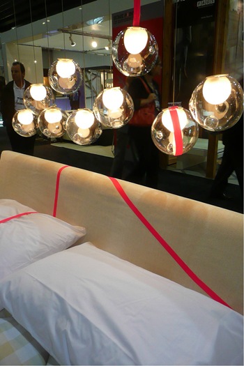
Bocci lights by Vancouver based Omer Arbel.


IDSwest Inform Interiors 1 
Inform Interiors
Nature at its best with thousand years old wood table and Mummy chairs by Edra.


IDSwest Inform Interiors 4
Inform Interiors
A whimsical Alessandro Mendini chair.
It was an intense four days of meeting new and old friends, learning from speakers (a post on Karim Rashid's talk will be published in a few days, I still need to put together the myriad of ideas that he talked about!) and checking what is new in the design field this side of the ocean. 

Stay tuned, more posts on IDSwest to come soon!

Photography © by Albarosa Simonetti
If you receive this post by Email and wish to leave a comment please click HERE and go to the comments section.
I love to hear from you!

Wednesday, October 13, 2010

Brillante choice: Moooi

Emperor suspended lamp

During the Design Week in Milan I enjoyed  Moooi's showroom, a company owned by  B&B Italia at 50%.
Designed by Neri & Hu  the Emperor lamp has a cage made of Bamboo rattan, the frame is aluminum and the diffuser is glass. Each cage is woven by hand, so every lamp is unique. It comes in various sizes, the largest being 35.4" by 63".
This lamp could be quite a statement for a large house.

Photography by Albarosa Simonetti
If you receive this post by Email and wish to leave a comment please click HERE and go to the comments section.
I love to hear from you!

Monday, October 11, 2010

The joy of autumn


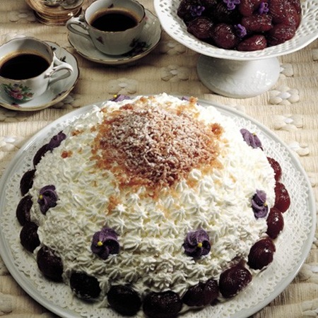
It is already officially autumn, grapes and chestnuts time (in Italian uva e castagne) and why not try an Italian chestnut dessert called Montebianco, named after the highest Italian Alps mountain, Monte Bianco, raising to 4,810 meters (and French too since it sits at the border of the two countries) with the charming town and elegant ski resort of Courmayeur, only less than two hours from Milan.

2FA79FC99ABB7248C07E8165AE9EED 

Montebianco can be decorated with Marrons Glacés (glazed chestnuts) and candied violets for a special occasion.
Montebianco (also called Montblanc if you are in France) needs some time for the chestnuts preparation, otherwise it is a very easy and rewarding dessert.
600 grams chestnuts and some sugar, salt and 2 bay leaves to cook them
100 grams of sugar
1/2 liter milk
100 grams of cocoa
a small glass of rum or cognac (in Italy we use acquavite also called grappa, very strong and intense)
shaved dark chocolate and whipped cream for decoration

Wash the chestnuts, cut through the shells with a small knife, put them in a pot of boiling water, boil them for about 10 minutes with salt, sugar and two bay leaves. Take out of the pot a few at a time and peel off the shells and inner skins while they are still warm.  Put peeled chestnuts in a  pot on the stove, cover them with milk and let it be absorbed at low heat for about 40 minutes (add more milk if necessary). Process in a blender or food processor or hand grinder while still warm, add the sugar, rum and cocoa then pass them through a potato ricer directly on the serving plate, consistency should be similar to mashed potatoes. Try to replicate the shape of a mountain.  Let it rest in the fridge for a few hours. When ready to serve decorate it with whipped cream, not too smoothly because you'll need to create the effect of  snow on the peak of the mountain. Add some shaved chocolate here and there if you like. 

This is another, more simple, way of presenting it.

montebianco

or in single portions.

3359457721_caed299574
Don't count the calories, just enjoy it!

If you receive this post by Email and wish to leave a comment please click HERE and go to the comments section.
I love to hear from you!
 
Clicky Web Analytics