Sunday, November 27, 2011

My cup of coffee


Let’s start saying that often Italian words are misspelled abroad, the image above is missing an f but I have chosen to use it anyway, to make a point, of course Caffè  would be the right word, as the others you will find below in Italic, always often misspelled.

A great cup of coffee is perfect at any time, an occasion to invite a few friends over in a rainy afternoon, a coupe de thèatre at the end of a formal dinner, any moment of the day is perfect:  a hearty cup of coffee  or cappuccino for breakfast, or an espresso after lunch or dinner.

A few curiosities about coffee in Italy:
I mentioned cappuccino… in Italy is served only in the morning, if you ask for it in the afternoon they know you are a tourist…but they know you are one anyway, so go for it when you wish! Another tip for a tourist:  pick the busiest coffee bar you can see near you, go to the till to pay and just say “Espresso per favore”  (or you can simply say “Un Caffè” and they know you want an espresso, no long explanations needed of low fat, tall, medium roasted with caramel and on and on… ) and still standing up  grab your cup, pour some sugar into your 30 ml of espresso, stir briefly and drink at once, leave your cup and saucer on the counter and  out you go to enjoy the day.


imagesCAPX1U9U 

cappuccino 

If you want something similar to the American coffee ask for caffe’ lungo, which has much more caffeine.  In Italy you always see people standing elbow to elbow with others while drinking coffee or aperitivo, a way of recharging batteries in a fast way (even if we invented Slow Food movement, but that is another story…). In the best bars, especially in the South you can often be served a small glass of chilled water on the side, which cleans the palate and enhances the coffee flavor.

Caffelatte is the usual breakfast for kids, lots of milk and just a small quantity of coffee, my mother used to beat for us an egg yolk with a spoon of sugar and pour it on top of the caffelatte, it made a rich, thick cream and it was delicious.

Grown ups, after meals like at times to have a caffe’ corretto, a way of modify an espresso with a drop of liqueur,  usually strong grappa or the sweeter sambuca.

Caffe’ macchiato is instead an espresso with a drop of hot milk.

clip_image002[5]
At home, when you entertain, to serve coffee the Italian way you will need the espresso cups with saucers, in a set or mix and match vintage colored pieces and coffee spoons, smaller and different than teaspoons and napkins also need to be small, like the ones used at cocktail parties, and preferably linen or cotton.

tazzine 

If possible serve on the side a selection of sugar, granulated or in cubes, raw or white ultrafine, and of course a small jug of milk is necessary if your guests want to add a drop of it and make it a macchiato.


clip_image002[7]

If you serve coffee after dinner it is preferable to leave the table and sit in the living room, when  after dinner drinks and a light assortment of friandise can end beautifully a great dinner (or save a mediocre one, when recipes did not behave as you wished!)  you’ll then have an assortment of  petit four, chocolate truffles or some small meringues.

chiavari-coffee-casa
In the afternoon, to enrich it further you could provide some whipped cream to make it Viennese style or in summer try to add a teaspoon of ice cream, to achieve a delicious creamy taste.

clip_image002
In any case coffee chosen must be of the best quality and always fresh,  buy the best coffee grinder you can afford and ground your own just before brewing so the aroma is at its best, use fresh, clean, cold water and make only the quantity you are going to drink, coffee should never (ever) be reheated and the taste deteriorates when left in the pot.

“Let’s meet for coffee” is a way of entertaining in style, with not much effort
and without spending hours in the kitchen. 

Now I leave you because I need a cup of coffee!
©2011 Brillante Interiors writes about new trends, timeless decor, iconic pieces, design ideas, or at times just musing about "a certain Italian way of doing things".

If you receive this post by Email and wish to leave a comment please click HERE and go to the comments section.
I love to hear from you!

Tuesday, November 22, 2011

Just for fun…double vision Art

Classic works of art re-imagined using photography.
Adobe has sponsored this fascinating creative competition where artists are encouraged to submit a “remake” of a famous work of art using photography. Of course some submissions are quite hilarious or ironic and although the winner has not been chosen yet (the competition is now closed), Canadian art blog Booooooom! has been posting some of the submissions:

  
American Gothic” by Grant Wood; “American Gothic” remake by Jesse John Hunniford


Roxana-Azar2 Roxana-Azar1
The Artist’s Mother” by James Abbott McNeill Whistler; “The Artist’s Mother” remake by Roxana Azar


 CraigWhite2 CraigWhite1
“Grande Odalisque” by Jean Auguste Dominique Ingres; “Grande Odalisque” remake by Craig White


BazookaBetty-2 BazookaBetty-1
“Self Portrait” by Frida Kahlo; “Self Portrait” remake by Bazooka Betty


ReginaSpeer2 carl spitzweg
“Der Arme Poet” by Carl Spitzweg; “Der Arme Poet” remake by Regina Speer


vermeer  wandamartin1
“Girl reading a letter by an open window” by Vermeer; “Girl reading a letter by an open window” remake by Wanda Martin.


Johannes_Vermeer_pearl Nienke-Zondervan
The Girl With The Pearl Earring” by Johannes Vermeer; “ The Girl With The Pearl Earring” remake by Nienke Zondervan

I am fascinated by the art of photography and by art in general, Vermeer being one of my timeless artists favorites, to the point that once having a 5 hours connection in Amsterdam, even if tired after a long flight from Vancouver  I took the tram and went to see again his stunning paintings at the Rijksmuseum. On the next flight I felt so refreshed and inspired.


marat2 marat1
“The Death of Marat” by Jacques-Louis David; “The Death of Marat” remake by Ewa Wiktoria Dyszlewicz


thron2 thron1
“Napoleon I on his Imperial Throne” by Jean Auguste Dominique Ingres; “Napoleon I on his Imperial Throne” remake by Isabella Materne and Christiane König.

This contest is absolutely brilliant and it inspired so many artists to create something totally new from iconic images, have you also noticed how gender is not so important any more?

Who is your favorite artist? Have you ever pushed the limits to see some of his/her projects?


©2011 Brillante Interiors writes about new trends, timeless decor, iconic pieces, design ideas, or at times just musing about "a certain Italian way of doing things".

If you receive this post by Email and wish to leave a comment please click HERE and go to the comments section.
I love to hear from you!

Thursday, November 17, 2011

Photo shoot of a project


Yesterday…rainy day in Vancouver but exciting photo shoot at Manito new store, where you can find luxurious silk bedding and more.  I have shown the “before” images of this project in my previous post HERE and now you can have a preview of the (almost) finished space.
As you may know a photo shoot requires days of preparation, sourcing for props, arranging furniture, adjusting lights, buying flower arrangements and in this case… steaming every single wrinkle out of pillowcases, bedspreads, bed sheets.


Manito Silk
The photographer, very professional and so pleasant to work with, Andrea Sunderland, arrived in full gear with diffusers, lenses, external flashes and all the tricks of the trade.


Manito Silk 

Manito Silk
Of course the store looked a …bit…messy since we had to arrange
and rearrange furniture and accessories every hour.


Manito Silk
A ladder certainly help to have different angles.


Manito Silk
Here I am, comfortably seating (for just 5 minutes!) and checking compositions and light with my point and shoot which I used all day wondering how magical the “real” images from Andrea will be.


Manito Silk photoshoot
Charcoal and pale blue silk for this bed with a vibrant orange lampshade on the side table.


Manito Silk project
Rich plum and fresh green silk for this image, Hilary Miles beautiful roses
and…do you remember that purple tea cup from a previous post?


Manito Silk images
A more masculine look with chocolate, champagne and whipped cream silk (yum).
Angela Grossman art piece on the floor.


Manito Silk project
Designers Guild pillows, Heather Ross new candles on the antique chair
and the vivid color of Miriam Aroeste painting as a backdrop.


Manito Silk photoshoot
My favorite picture of the day? I can’t explain it but it is this one…so dramatic  and theatrical.

Silk becomes regal!

Photography © by Albarosa Simonetti

©2011 Brillante Interiors writes about new trends, timeless decor, iconic pieces, design ideas, or at times just musing about "a certain Italian way of doing things".

If you receive this post by Email and wish to leave a comment please click HERE and go to the comments section.
I love to hear from you!

Monday, November 14, 2011

Home Sweet Home!


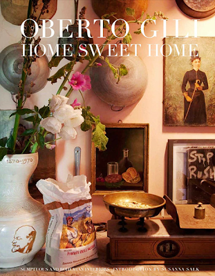
This month’s book is “Home Sweet Home” (Rizzoli) by worldwide famous photographer Oberto Gili.
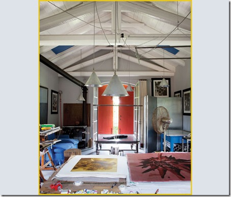
His house is in New York since the Eighties but his “home” is still in Piedmont, Italy, where he was born and where he constantly returns.  Here he has cows, acres of land he loves to work on, vegetable gardens, grape vines and most important his four beloved dogs.
In this town he lives a totally different lifestyle from the one in New York or when he travels around the world, in touch with  celebrities and going to parties in the most  elegant houses.
Here he completely restored a dilapidated farm house near his family home, leaving wood beams, old cotto floors, creating a charming and cozy atmosphere of yesteryears.
Furniture and accessories are all part of his life, he says that every object has some happy memory and of course the walls are decorated with his photography and many pieces of artists friends.


01b_casa-studio-picot-gili
The dining room with a table, designed by Gili, that can sit 16 people, a 1700 armoire and two sofa beds from 1800. An eclectic interior where everyone feels welcome and lively conversation comes natural.


03b_casa-studio-picot-gili
The kitchen, in different shades of green has a large credenza full of jars with preserved fruit and vegetables, a passion of the photographer, who spends hours preparing and canning them when in town.


04b_casa-studio-picot-gili
An American mantle for the fireplace in the living, colorful sofa and chairs and on the main wall two Gili’s framed photographs. As you can see the dogs are a major part of his life there and are treated like family!


05b_casa-studio-picot-gili
Another Gili’s piece, over an antique dresser.


06b_casa-studio-picot-gili
Vivid colors in the master bedroom, with a flaming Moroccan rug and vibrant art on the walls.


02b_casa-studio-picot-gili
In his pale blue bedroom he created a corner to work, with simple furniture, like many others around the house which are salvaged old pieces, and a beautiful old chandelier he found in a flea market.


07b_casa-studio-picot-gili
A small room in the guesthouse with different styles put together in an harmonious way.


09b_casa-studio-picot-gili
The white studio of Oberto Gili, with incredible natural light. Pendant lights were also designed by Gili. Of course the natural light can be totally obscured by heavy drapes when needed.


08b_casa-studio-picot-gili
Old charming French doors opening to the luxurious garden.

A real “Home Sweet Home” where life can be happy and easy and where the artist can recharge and create while away from his intense life in New York.

Photography by Oberto Gili

©2011 Brillante Interiors writes about new trends, timeless decor, iconic pieces, design ideas, or at times just musing about "a certain Italian way of doing things".

If you receive this post by Email and wish to leave a comment please click HERE and go to the comments section.
I love to hear from you!

Thursday, November 10, 2011

My favorite graffiti!


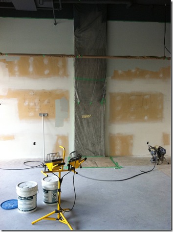
My favorite graffiti? are the ones that lead to a well prepared and managed project and I will show you some steps of my latest effort.  Above are some instructions for trades drawn on the walls by the contractor for the correct execution of the project.

photo-1926038091      

A large open space in the beginning, with a door going to the secured parkade in the back, no washroom, only a pipe and a hole on the far right corner!

photo-74926363 

Even if we had drawing plans, using tape and drawing shapes of the correct size were necessary to be absolutely sure there would be space for handicapped people to move around in the washroom, before walls were built.


varie 070 

The space was carefully measured and the drawing plan created  two separate areas, one for retail and one for the storage, the office and of course for the new washroom. Ceilings being very high the new walls had to be appropriately sized.


  varie 074

One of my favorite parts, even if challenging, is testing the paint before it goes everywhere. Of course patches of different paint were scattered around to examine the different lights conditions and left there to dry and be examined at different times of the day. This time the challenge was even greater since there was still no washroom installed so not even a drop of water in the space, but I managed to arrive those days with buckets of water in my car to wash brushes between different colors and lots of rags and paper towels. I was testing the colors myself since there were some delays (sounds familiar?) and trades were busy.


varie 095 


varie 080 

Washroom and storage area created by the new walls, plus the necessary stereo-radio that every trade likes to blast!


varie 089 

Preparation before the first coat of paint.

varie 114 

Yards and yards of painter tape…


varie 105 

On the window the necessary Permit forms ready for the approaching inspection.


varie 118 

Ceiling sprayed in charcoal.


varie 115 

Concrete columns were carefully covered  to leave them intact, part of the industrial look that the space had, together with high ceilings and pipes, that I wanted to preserve.


  Manito Silk new store

Yes, it is me… taking pictures a few months ago at the front window of the new store with its temporary sign. Exciting news: after a few months of decisions making, drawing plans, revising budget, sourcing and testing…Manito store in Vancouver, already open to the public at 1822 West 1st Avenue, at Burrard Street, is about to be ready for a grand opening party!


Photography by Albarosa Simonetti

©2011 Brillante Interiors writes about new trends, timeless decor, iconic pieces, design ideas, or at times just musing about "a certain Italian way of doing things".

If you receive this post by Email and wish to leave a comment please click HERE and go to the comments section.
I love to hear from you!
 
Clicky Web Analytics